|
Teaching Beginners |
Marcy Petrini
July, 2026
I love to teach beginning weaving. When those wefts cross the warp for the first time, the magic begins with a satisfied look that says it all.
Students receive a beginning weaving monograph (see below); after each session they review the section they used (yes, it’s homework and they do it!). Of course, during class I am there to help and so are the more experienced students.
After that first beginning class, many students opt to continue: a new convert! A new member of our tribe!
The second project is usually a twill. We use the planning sheet in their monograph, and we go over the various steps.
As they work I see them often referring to the monograph, pondering what comes next. As the whole process is repeated, students become confident, but sometimes they still need to search in the monograph for the next step. And occasionally – oops – someone forgets a step. Not fun.
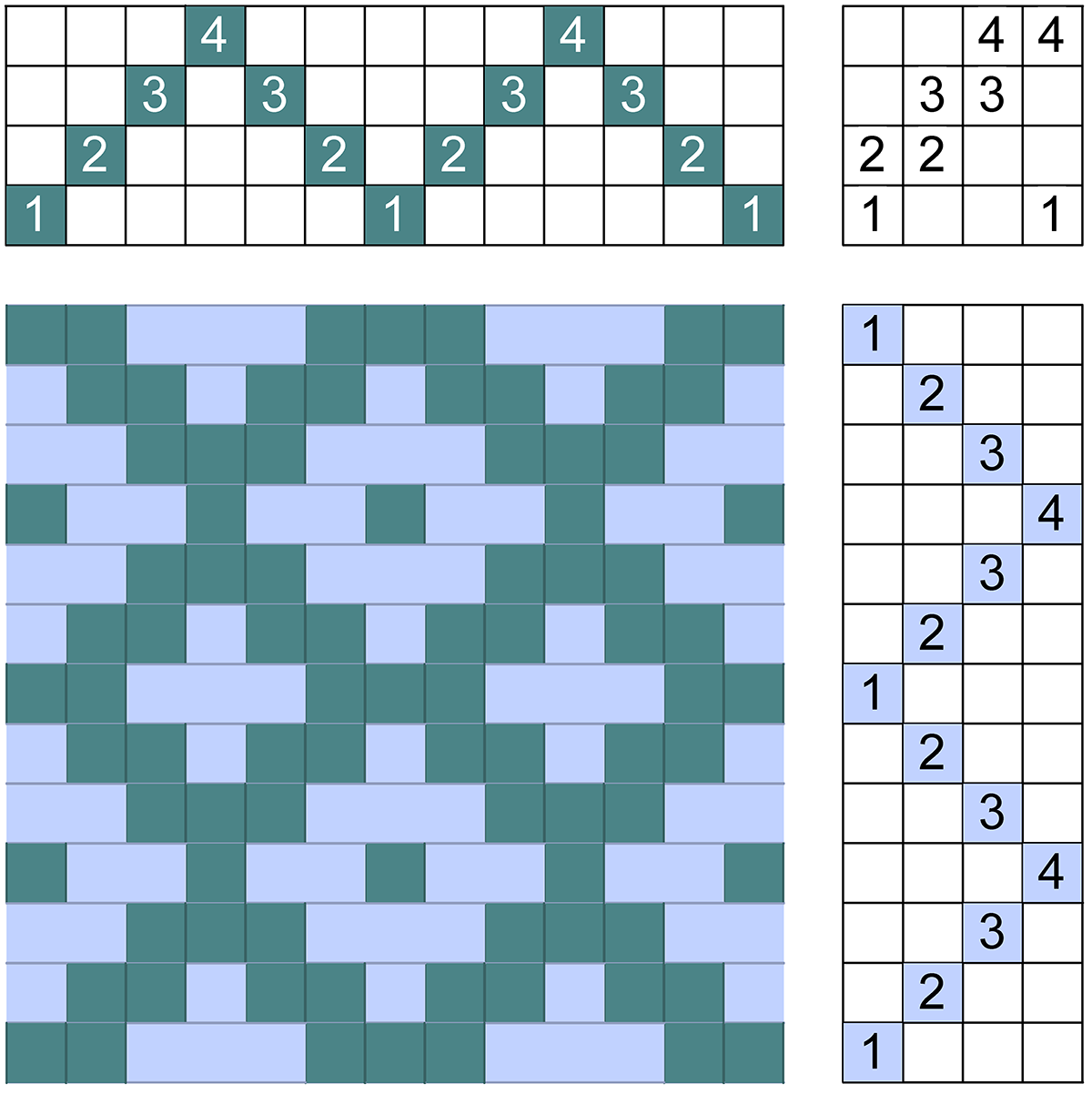
To avoid forgetting steps, I devised this checklist that includes the steps from planning the project to wet finishing (download the checklist PDF here). It’s not to replace the monograph, but as a quick reminder, so no steps are missed.
I color coded the checklist by groups so finding the next step is easier: planning (yellow), warping (blue), weaving (green), and finishing (pink)
We dress the loom from the back to the front, so the checklist takes the students through those steps. There are various ways to perform all the steps for weaving, use what works for you.
Happy weaving – and happy teaching!
Marcy
|
TAW Revisited |
Marcy Petrini
June, 2026
In the last month’s blog, we discussed tromp-as-writ – treadle as written: given a twill, we can derive the treadling when using the standard tie-up for twills, that is, two treadles at a time, forming the diagonal that defines twills.
Below again is the pointed twill example: threaded 1, 2, 3, 4, 3, 2, repeat, the treadling sequence is also 1, 2, 3, 4, 3, 2, repeat. (Drawdown is rising shed.)
Tromp as writ can also be applied to block weaves, but it works best if we use a profile draft.
Below is a simple example of a profile draft. It tells us to thread block A, then B, C, D, C and B again (repeat). The tromp as writ treadling is to weave block A, block B, etc.
|
|
|
D |
|
|
|
|
|
C |
|
C |
|
|
|
B |
|
|
|
B |
|
|
|
|
|
|
|
A |
While profile drafts are extremely helpful when designing fabrics with block weaves, we must remember how many shafts we have available, because for each block, we must substitute the threading of that block.
Using the simple profile draft above, for summer and winter block A is threaded 1, 3, 2, 3; block B 1, 4, 2, 4, etc. Thus, we need six shafts to weave the 4-block profile draft.
For the tromp as writ treadling, we weave the treadling steps of block A, than block B, etc. The drawdown is below. It is sinking shed, even though I weave on rising shed looms; I find it easier to think of block weaves as having the weft cover the block: thus, for block A, shafts 1 and 3 followed by 2 and 3 are lowered, allowing the weft to cover the warp on those shafts. The tie shafts, 1 and 2, alternate in limiting the float; the resulting blocks are not solid and in the fabric background the warp peeks through.
The drawdown shown is a bit deceiving if we are not familiar with the structure. Every pattern pick of summer and winter is surrounded by tabby picks that form the background. Thus, we need two additional treadles to weave it.
Here is partial drawdown for block A that shows how our weaving actually proceeds:
Below is the fabric sample using the profile draft but woven with a different treadling; it does show the blocks and the background formed by the warp and ground tabby.
Profile drafts work best with tied unit weave of which summer and winter is one. The blocks are fixed; if we need a wider area, we simply increase the number of blocks, but the length of the floats stays the same.
Most tied unit weaves have a treadling generally associated with them, although many more options are possible. The drawdown above shows the treadling for summer and winter called single (each single pattern shaft is treadled with each tabby), while the fabric sample was woven using the treadling called “treadling o’s” because of the appearance of the blocks. Thus, the profile draft doesn’t specify which treadling to use, just the order of weaving of the blocks; the weaver chooses the treadling. (For more on summer and winter and its treadlings, see the entry in Block-Aid).
For other block structures, the weaver must make a decision as to the width of the block. For example, let’s use the same profile draft for overshot.
I learned block A of overshot as 1, 2, 1, 2. Others consider 1, 2 the kernel of the block. Either way, the block could also be 1, 2, 1, 2, 1, 2 and so on as long as shafts 1 and 2 alternate. The weft floats over the width of the block, so the size of the yarn should also determine the number of threads in that block. In a block too wide, the yarn will sag.
Block B of overshot is 2, 3, 2, 3. Shafts are shared between blocks, resulting in four blocks on four shafts. Thus, the profile draft we have been using could be applied to overshot on four shafts.
The blocks don’t have to be the same number of threads, just as long as each follows the definition: 2, 3 for B, 3, 4 for C, 4, 1 for D.
Below is the sinking shed drawdown we obtain when we use block threadings for the profile draft. As in summer & winter, each pattern pick is surrounded by a tabby pick. The tabbies are shown at the bottom of the drawdown. Overshot is derived from twills, so the tabbies are the classical 1 & 3 vs. 2 & 4. In contrast the tabbies for summer and winter are ties – 1 & 2 – vs. all pattern shafts.
Below is the fabric sample. Overshot has three classical areas: the overshot blocks made by the pattern weft, the plain weave blocks where the pattern weft floats on the other side of the fabric and the half-tones where the pattern weft peeks through the ground.
Below is another profile draft which illustrates both its usefulness and how well its use fits tied unit weaves.
|
|
|
|
C |
C |
|
|
|
|
|
|
B |
B |
B |
|
|
B |
B |
B |
|
|
|
|
|
|
|
|
|
|
|
A |
A |
We can substitute the blocks in the profile draft with a threading for a tied-unit weave shown in the drawdown below. This structure doesn’t have a common name, but can be classified as having two pattern shafts per block (3 & 4 for the first block), two ties that are unpaired because they are not next to each other (1 & 2 for all blocks) with a ratio of 1:2 (2 tie threads & 4 pattern threads or 2:4 is 1:2). This nomenclature of “double, two-unpaired ties, 1:2 ratio” is not unique, so we have to add what makes it unique: the pattern shafts are arranged in reverse pointed order with the ties.
The name is not important. What matters here is how wide the threading would be if we expanded the entire profile draft. Given the name and the threading of the first block, we can derive the rest of the threading.
There are two blocks A, three blocks B and two blocks C, three blocks B, then the repeat starts. Below is a fabric sample.
While the first profile draft in this blog was easily woven with overshot – or any other structure with variable width blocks – the profile draft we just used doesn’t easily convert: what does it mean to have two blocks of A in overshot, when one block can be as wide as we like? However, we could take this profile draft and adjust it for relative size: block A and C could be the same size, block B a third wider.
In designing, profile drafts are very useful. We can manipulate our tools to fit our needs.
Happy weaving!
Marcy
|
What Treadling Should I Use? |
Marcy Petrini
May, 2026
Once threaded, there may be many options for treadling. Every structure has its own, but using others is a good way to weave unique projects on a single long warp.
Beginners can be overwhelmed by the choices, however. What will work best?
I like to think of the treadling possibilities as broadly falling into four groups: 1. Treadling specific to the structure; 2. Alternate treadling for a structure; 3. Using the treadling of one structure on the threading of another; 4. Treadling methods, that is, treadling directions that are not associated with any structure, but can be applied to various ones.
This way of thinking works well for four-shaft structures, but with more it can become ambiguous. However, once we understand the options, choosing alternate treadlings can be applied to any shafts.
A Structure’s Own Treadling
A fabric determines the structure, and to be able to weave a specific one, we need the threading and treadling steps that define that structure. When we look at the various weaves, it seems likely that many of them were derived in a circular way: threading, then treadling steps, back to threading, etc. Thus, it is often difficult to look at a threading and figure out what its own treadling is.
The twills called “regular” are the exception; they use the standard tie-up on four shaft, which uses all four shafts taken two at a time. Of the resulting six possibilities, four are used for twills. Incidentally, it is not by coincidence that 4-shaft looms often have six treadles.
Emery’s definition of a twill is: progressive successions of floats in diagonal alignments. If we look at a twill fabric, the diagonal is often obvious as in the fabric below.

We can see that diagonal alignment below in the drawdown of the four-shafts straight twill, which was used to weave the sample above.

The threading, treadling and the four treadles are all arranged in a diagonal. Of the six possible treadles in the standard tie-up, twills use the four that allow the diagonal to form: drop one shaft and add the next: start with 1 & 2, then drop 1 and add 3, that is, 2 & 3, etc. (The other two treadles of the standard tie-up – 1 & 3 and 2 & 4 – are used for plain weave.)
The treadling shown here for the straight twill is called “tromp-as-writ”, that is, treadle as written. We can see the steps in the drawdown above: the threading is 1, 2, 3, 4, the treadling is 1, 2, 3, 4; again, this works with the standard tie-up. There are other twills that do not use it.
Knowing the tromp-as-writ rule, means that we can find the twill’s own treadling. For example, let’s use the pointed twill: the threading is 1, 2, 3, 4, 3, 2, repeat; the treadling is 1, 2, 3, 4, 3, 2, repeat, when using the standard tie-up.
Here is the drawdown:

While all structures have a treadling of their own, it is not always possible to obtain it by simply looking at the threading.
Let’s take huck, for example, a rectangular float weave (by Emery’s classification, one warp, one weft, with blocks of floats). If we are familiar with this structure, or if we look it up, this is what we find on four shafts: two blocks treadled to obtain weft floats; the drawdown below is a rising-shed drawdown, showing two repeats.

Without getting too caught up in the details, we see that huck is derived from plain weave. We can see how plain weave fills the fabric where there are no floats; the floats are obtained by removing one of the plain weave shafts in the treadling. However, we have to start with a specific threading.
Regardless, we recognize that drawdown as the directions for weaving huck.
Alternate Treadling For a Structure
Huck forms the weft floats we have seen in the previous rising-shed drawdown while warp floats are formed on the other side of the fabric.
We can add to the tie-up to give us the treadling steps to weave warp floats, in addition to weft floats, on the same side of the fabric, as shown by the rising shed drawdown below.

We can also combine the warp and weft floats to form huck lace, as shown in the next drawdown.

While it is great to have all these options for treadling, cautions must be used in some cases when applying an alternate treadling to a threading. Huck is one of those case. Both huck with weft and warp floats can be easily exchanged – they are, after all, different sides of the same fabric. Huck lace, however, has more drape, so adjustments must be made up front with the block design and the sett to avoid a sleazy fabric, rather than a lacey one.
Other common structures have treadling options; for example, overshot tromp-as-writ treadling is called “start fashion” but “rose fashion” is an alternative. Summer and winter is woven in “singles” but treadlings for “paired x’s” and “paired o’s” are popular options (These are described in the Pictionary©, look them up if you want to know more).
Using a Treadling of One Structure on the Threading of Another Structure
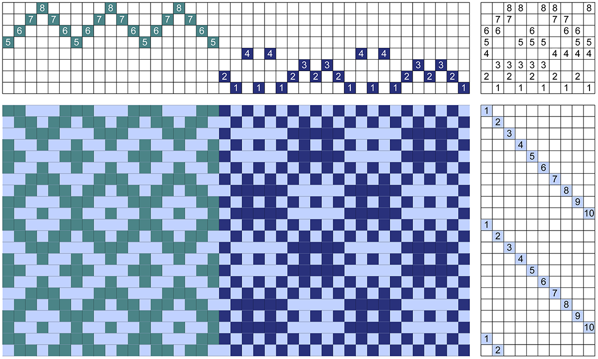
Twill gamps are the perfect example. Several threadings are used across the fabric and then each is woven with its own treadling. Besides the tromp-as-writ fabric for each twill, we obtain all the other possibilities.
Below is the drawdown of my twill gamp as an example.

Starting at the right-hand corner, I used a straight threading (sometimes called straight draw, shown in red) followed by a pointed threading (in green). I started the treadling with a straight draw (in yellow); the upper right portion of the drawdown above is the straight twill, tromp-as-writ. Next to it on the left, there is a straight treadling on a pointed threading.
The second treadling is called return or pointed (in blue); on the bottom left corner we have the tromp-as-writ for the pointed threading, the pointed twill. The blue weft on the red warp forms a straight threading with a return treadling.
Thus, for two threadings and two treadlings, we have four possible fabrics!
|
Pointed threading |
Straight twill |
|
Pointed twill |
Straight draw |
Note that, in the nomenclature above, there are two twills, that is, two threadings with their respective tromp-as-writ treadlings. The other two are combination of threadings and treadlings. That is, we cannot call the yellow and green square a pointed twill with a straight treadling! The fabric determines the structure and that square is not a pointed twill! Clear vocabulary makes for clear thinking. And, yes, I have been known to slip-up and call a pointed threading a “twill”. If it doesn’t look like the blue weft on the green warp in the drawdown above, it’s not a pointed twill!
While the mixing and matching of twills is widespread, there are other threadings that borrow the treadling of others. Summer and winter, for example, can be treadled as overshot.
Treadling Methods
As I said in the introduction, treadling methods are directions without threading of their own. Generally, they can be applied to more than one threading, but not to all categories of threadings. They are not structures, despite the fact that sometimes they are called “weave”.
In fact, waffle weave is one favorite treadling method, applied to some type of pointed threading. Below is the drawdown, which shows some 5-thread long floats on this particular pointed threading.

The plain weave sections that appear throughout the fabric cause the floats to be pulled in resulting in the “waffles” that give the treadling method its name.

The Pictionary© has more treadling methods. Try them for yet other treadling options.
Study all your possibilities to determine the best use for the final fabric.
Happy weaving!
Marcy
|
Combining Structures |
Marcy Petrini
April, 2026
I like to combine twills to obtain original ones. There have been examples in my previous blogs, including the last two, February 2026 and March 2026 with the sapphire scarf.
What about combining other structures?
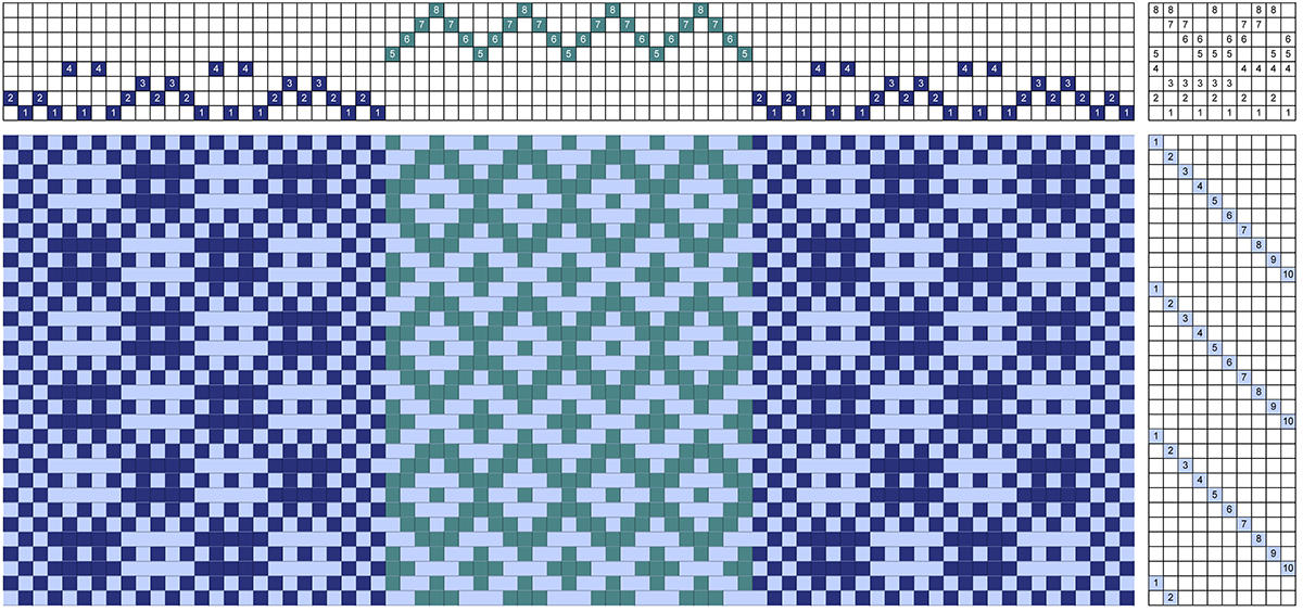
I thought about this before and, of course, it is possible in many cases. We can combine two four-shaft structures to an eight-shaft loom. The treadling steps have to either match in number or be modified. Think for example of the four-shaft Bronson lace with 12 steps and the pointed twill with 6; we can simply match them by doubling the pointed twill treadling.
However, when combining huck lace with 10 treadling steps and the pointed twill, we have to make adjustments.
Let’s start with huck lace, a treadling options for the traditional huck threading; the tie-up has 4 treadles.
However, those steps are repeated to form the floats; in order to combine them with another set of treadling steps they have to be listed individually as shown below.
To combine this huck lace with a twill, we need 10 treadling steps. I started simply with a pointed twill. The tie-up is 4 treadles, but there are 6 treadling steps, as shown below.
We need 10 treadling steps to match the huck lace. I can add some by weaving the pointed threading with a bird’s eye treadling. Note that while the tie-up is still 4 treadles, there are now 8 treadling steps.
We need two more. We can add the rosepath treadling to the drawdown above.
By adding the 4 & 1 step after the 1 & 2, we have to include both in our total; we have 10 steps! Now we can expand the treadling as shown below.
Next we can combine the two structures as shown in the following drawdown:
If I were to weave this, I would make some changes. I would add a bit more plain weave to the huck threading along the vertical edges, to separate it better from the twill. I would shift the treadling of the twill to start at treadle six to avoid partial motifs. Thus shaft 1 is attached to 2, 4, 5, 8; the rest of the tie-up rotates accordingly.
When I combine twills, I often like to balance the motifs. If I were to weave this drawdown, I would balance it as well. I would either start and end with the twill or start and end with the huck, as I have done in the drawdown below. I think in this case the fabric would be more pleasing when balanced.
What structures would you like to combine?
Happy weaving!
Marcy
|
More Sapphire! |
Marcy Petrini
March, 2026
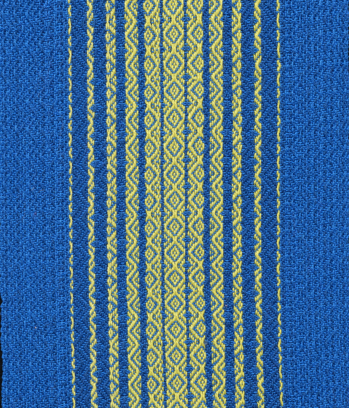
In February, I described how I arrived at finding the sapphire colors I needed to design a scarf for the Chimneyville Weavers and Spinners Guild 45th Anniversary celebration. I used Munsell 10 blue for the sapphire blue and Munsell 10 yellow for the sapphire yellow.
The scarf is off the loom and in the exhibit that the CWSG organized for our celebration. Here is a photo:
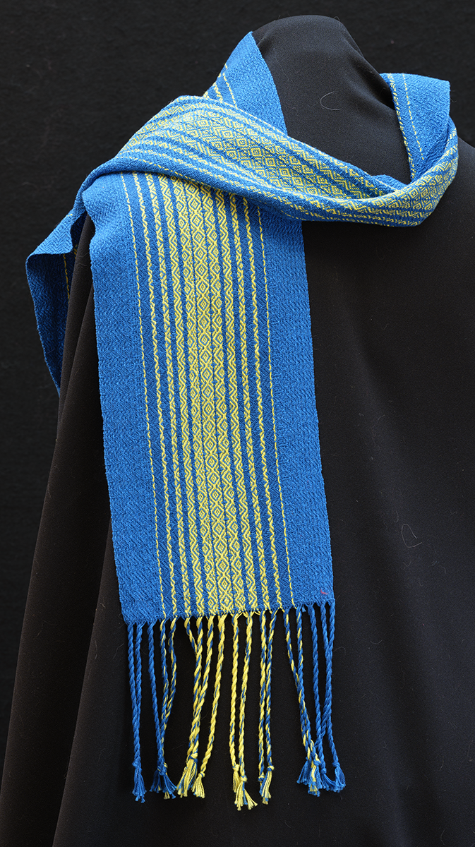
The two opponent colors – blue and yellow – with the twill lines make the scarf shimmer in the light as we can see from the photo.
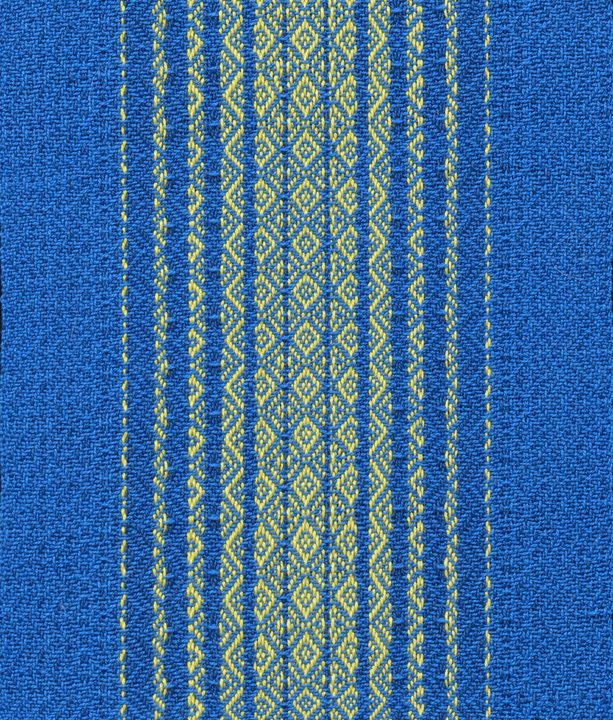
Below are close-ups of the front and back of the scarf.
 |
 |
When researching what is considered the standard sapphire blue, I came across other sapphires with descriptors to distinguish them from the standard. Once I was settled on what I wanted to weave, I became curious how these different sapphires may look.
I found six other hues (Munsell’s terminology for color) that carry the sapphire name: bright sapphire, deep sapphire, royal sapphire, cobalt sapphire, Pantone’s blue sapphire and one simply called sapphire by some, but dark cyan by others.
Just as in the standard sapphire blue, all these other sapphire hues have hex numbers which can be translated into the percentage of RBG out of 100% for each color. Two other parameters can also be calculated: the value and the saturation.
The value as used in the Munsell’s system – also known as lightness in computer graphics – represents how light or dark the color is, obtained by adding black or white; a value of 100% is pure white, 0% is pure black.
Saturation is similar in concept to Munsell’s chroma, how much of a given hue is present; this allows us to distinguish sky blue from navy blue.
It’s fun to see how these sapphire hues compare. Below are tables with the numerical information and squares of the hues for comparison (much of the information is from ColorHexa.com).
|
Color Name |
Standard Sapphire |
Bright Sapphire |
|
Hex Code |
0f52ba |
0067bc |
|
Red |
6% |
0% |
|
Green |
32% |
40% |
|
Blue |
73% |
74% |
|
Lightness (or Value) |
39% |
37% |
|
Saturation |
85% |
100% |
The standard sapphire blue is vibrant from the red / green interaction; the bright sapphire blue has no red, more green and a similar amount of blue. As a result, bright sapphire is more saturated, resulting in a deeper color.
|
Color Name |
Standard Sapphire |
Deep Sapphire |
|
Hex Code |
0f52ba |
082567 |
|
Red |
6% |
3% |
|
Green |
32% |
15% |
|
Blue |
73% |
40% |
|
Lightness (or Value) |
40% |
22% |
|
Saturation |
85% |
86% |
Again, the standard sapphire blue is vibrant from the red / green interaction; the deep sapphire blue has much less red, green and blue. With this smaller amount of illumination, the sample is much darker (the lightness/value is less).
|
Color Name |
Royal Sapphire |
Cobalt Sapphire |
|
Hex Code |
305cde |
0047ab |
|
Red |
19% |
0% |
|
Green |
36% |
28% |
|
Blue |
87% |
67% |
|
Lightness (or Value) |
53% |
34% |
|
Saturation |
73% |
100% |
The brightness of the royal sapphire is also from the red/ green interaction that we saw in the standard sapphire, with more red and a higher value. Compared to it, the cobalt sapphire is intense, with no red, relatively more blue and a higher saturation. The cobalt sapphire is darker since the red, green and blue numbers are all smaller than with the royal sapphire.
I found it interesting that the Pantone’s Blue Sapphire has a lot of green, leaning it toward teal; and following that lead, a color called dark cyan by ColorHexa.com is called “Blue Sapphire” by others. Given that the green sapphire gems are some of the rarest, those color names are understandable.
|
Color Name |
Pantone’s Blue Sapphire |
Blue Sapphire (Dark Cyan) |
|
Hex Code |
126180 |
006e75 |
|
Red |
7% |
0% |
|
Green |
38% |
43% |
|
Blue |
50% |
46% |
|
Lightness (or Value) |
29% |
23% |
|
Saturation |
75% |
100% |
The deep teal of the Pantone sapphire is from more red and less saturation than the blue sapphire / dark cyan. The dark cyan has nearly equal amounts of green and blue and full saturation resulting in cyan being a better descriptor of the hue.
By the way, if you print this blog, the sapphires may not look the same as on the screen because, while the RGB code is how the screen’s pixels present colors, printers use CMYK inks – hence some sort of conversion is needed.
What a wonderful experience! Who knew that starting with a simple question – how did we get from sapphire the gem to sapphire the color? – would lead to a path that taught me some color history, some color nomenclature and more about the interactions of colors.
Check out the ColorHexa.com website, it’s a great resource for thinking about color schemes for your yarns.
Happy Weaving in Color!
Marcy