Handmade Gift Giving
Marcy Petrini
December, 2016
Let’s hope that my sister doesn’t read my blog before Christmas, or her surprise may be spoiled…. She is the lucky recipient of the handwoven scarf shown below, in a twill with a variegated red silk warp from RedFish Dyeworks and a red Blue Heron rayon and metallic weft. The rayon can be a bit heavy, but the silk lightens the scarf up up, so that it has a nice drape; the interplay of the various reds and the gold metallic gives it sparkle and shine. I am tempted to keep it…. But I won’t – but I may make myself one!

My brother-in-law is receiving this hand knit scarf in seed stitch, with handspun of silk and yak; he likes to go winter camping in the Rockies, so this is sure to keep him warm.

I often advise students not to give their handwoven or hand knitted work as a gift to friends who may not appreciate it – and to be very careful in thinking who will truly value it. I believe that people don’t really realize how much thought, work and care goes into our handmade pieces, even those who may practice other fiber crafts may not have a true understanding.
I will never forget this brief encounter: it was the late 70s, and I had been weaving only a couple of years; I entered the elevator with a woman who worked in the next department, whom I often saw in the hallway; she said to me that she heard that I wove, that she cross stitched, and, in fact, she planned to cross stitch afghans for her Mother and Mother-in-Law, 50 squares each, with the birds of the 50 states in one and the flowers in the other. And, she added, “I thought it would be a nice touch if you wove the fabric for me to cross stitch; how much would the materials cost?” After I bit my tongue, I smiled and said that I didn’t weave for others, but I knew weavers who did, that I would be glad to refer her to some, and that she could expect to pay $50-$60 per yard for custom handwoven fabric (remember, this is late 70s). She looked at me as if I was from Mars, I am not sure whether it was because I wouldn’t just weave the fabric for the honor, or whether she couldn’t believe that handwoven fabric would be that expensive. She clearly didn’t have a clue about what it takes to weave fabric.
It’s not unusual for me to overhear buyers surprised by the price when looking at handwoven or hand knit works by my Craftsmen’s Guild colleagues. Fiber, more so than other crafts, it’s undervalues because after all, “my grandma did that.”
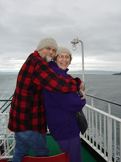
Over the years, I have been very wise in my gift giving of handmade pieces. There are only three or four that I regret giving. But those few times have been far outweighed by the joy I have experienced when I have given items to people who truly appreciated them. I clearly remember having spun the yarn from Ronaldsay wool for seven caps; the fiber was of different natural colors, so each cap would be a bit different. Six of us were going to Oban, Scotland to meet our Scottish friend; Scotland was suffering from a heat wave; still, I was knitting the last two caps while going from home to Oban via Edinburgh; my sister thought I was crazy to be knitting wool in that heat. But the weather turned cold and those caps were the hit of our group, and they are still in use, all these many years later. Here Terry and I are sporting ours as we embarked the ferry in Oban.
Please email comments and questions to
“Inspiration is for Amateurs”
Marcy Petrini
June 19, 2016
I was reading my current issue of Handwoven (#180, May/June 1916) which includes a nice project by Rebecca Fox called Plan B Pillow Top, where she explains how she changed course when a fabric she originally designed for a scarf made a better pillow.
What struck me right below the title of the article was a quote by painter and photographer Chuck Close that said: “Inspiration is for amateurs; the rest of us just show up and get to work.” So I am back thinking about inspiration.
I couldn’t disagree more with the “Inspiration is for amateurs” part. Perhaps it’s just a poor choice of words.
“The rest of us just show up and get to work” is, of course, saying “just do it.” But to “just do it” we need inspiration.
I would argue that the non-amateurs – for a lack of a better word – internalize the inspiration. The sunrise on the beach (Space Coast, FL, June 2016) will find itself in some weaving: maybe a color combination, perhaps the undulation of the waves, or maybe remembering the pebbly texture of the sand.

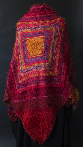
We are moved by music: the opera Carmen by Georges Bizet inspired two of my shawl, here is the latest knitted one:
The wonderful smell of freshly cut grass inspired the woven shawl “Stepping through the Garden”:

We take all of our sensory inputs and make them part of our being, and in turn they show up when we “show up and get to work.”
None of us stare at our warping board and say: “oh, muse, show me what to weave next.” We sit down with an idea of turning some beautiful yarns into gorgeous fabric – where does that idea come from? Inspiration!
Chuck Close’s advice to young artists is “not to wait around for inspiration.” I would say that a better advice to young artists is to pay attention so that the sights and sounds around us become internalized: notice the small and large things you encounter, stop and smell the proverbial roses, carefully observe the world around you, not only what Mother Nature offers but also what human ingenuity has created (Rocket Garden, Kennedy Space Center, Space Coast, Florida, June 2016).

Then “showing up and getting to work” – just do it! – become infinitely easier.
Please email comments and questions to
Technology and Crafts
Marcy Petrini
November, 2016
Recently Nancy Perkins, Executive Director of the Craftsmen’s Guild of Mississippi (CGM), told me that there has been a discussion in the CGM Board of Directors about the technology in fine crafts and at which point using technology eliminates the individual practitioner’s creativity because the computer software dictates what the individual does – should that craftsperson, then, be granted juried membership in the Guild?
This is by no means a new argument; in the early 1980s, as computers started to become available for home use, I, and several others in the weaving community, wrote programs to do drawdowns; some believed that it was “cheating” – that the computer was doing all the work; in fact, all the computer did was fill in squares where the user told the program a square should be filled, to represent a warp or a weft thread. In the summer 1983 I wrote an article for Shuttle Spindle & Dyepot entitled “Computers Don’t Weave”. Now, over 40 years later, whether one uses drawdown software or not, I think that nobody would consider using it “cheating”, any more than writing with a word processor is.
I can’t speak for the crafts that I don’t practice, but I do use a computerized loom and I think that it allows more creativity not less! I realize that most people reading this blog are weavers and so I am preaching to the proverbial choir. However, feel free to refer people to these explanations when you hear that argument. Also, should you be thinking about a computerized loom, this will give you an idea of the advantages – and disadvantages – of using one. At Convergence™ 2014, I presented a seminar on this topic for people who were considering such a move, so I have thought about this problem for a long time (if you would like a copy of the handout, please click here).
At the core of the argument is creativity, originality and one’s own work.
First, though, we need some definitions since some of those terms are used differently by various crafts. If I say that I wove a scarf with a straight twill, a weaver knows exactly what pattern I am talking about. In weaving, a pattern is usually a particular weaving structure; even if you had to look up a more complicated pattern, for example an “M and W twill”, that says nothing about your creativity, it’s like looking up a word in the dictionary. With the same exact pattern, you could weave a flowing shawl, a well-balanced fabric to use in sewing a garment, a sturdy place mat, and an even sturdier rug. All possible because of your knowledge of fiber, yarn, sett, beat and, yes, creativity.
In contrast, for example, when knitters say “pattern”, they may mean directions that one could obtain from published sources. Depending on how difficult the pattern is – and publications may offer that information – the knitter could buy the recommended yarn and needle size and knit the item from the pattern. There could be tremendous skill in the task, but no creativity. Another knitter may design her own pattern which, in addition to skill, would require creativity as well.
Part of the problem in this discussion, then, is how the word “pattern” is used by different people in different ways – and sometimes by the same person in different ways.
So, for starters, using a pattern does not preclude or include creativity. You have to dig a bit deeper. Although I must admit that the “rule” that I heard that changing somebody else’s work by 20% makes the work original is a bit of a stretch for me. We all “steal like an artist”, but the whole point of creativity is to synthesize those elements in a novel way so that it truly becomes a reflection of us as an individual; that is the essence of Austin Kleon’s book Steal Like An Artist, which I highly recommend.
Back to the loom. What does a computerized loom do for me?

First, let’s consider what we can do with the usual four-shaft foot-powered loom; to form a shed where the weft will be placed, we have to have some warp threads down and some threads up; that is, some shafts must be up and at least one shaft must be down or vice versa. It turns out that taking shafts one at a time, or two at a time, or three at a time gives us 14 possibilities, for each shed. Clearly there are a lot of possibilities for weaving, but we are usually limited because we step on treadles on the floor to activate shafts up or down, and usually four-shaft looms have six treadles because of space limitations, so we have to be inventive about how we use the treadles and there are some sequences that are simply not possible.
As we increase the number of shafts, we obtain more pattern options, but the possibilities can become staggering. I have forty shafts, think about what’s available: shaft # 1 vs. the other 39, shaft # 2 vs. the other 39, and so forth until we get to shaft # 40 vs. the other 39. And then we move to shafts 1 & 2 vs. the other 38, and shafts # 1, 2, 3 vs. the other 37, etc. How many treadles could you fit under a 40 shafts loom? That depends on the width and even a 60” wide loom wouldn’t have enough, and it’s hard to weave on anything wider than 60”.
So, the computerized loom, used this way, is a mechanical device. I enter in the computer program what shafts I want lifted – my pattern – and the computer sends a message to a dobby that lifts the shafts I told it to lift. Not only I don’t have enough room for treadles under my loom, but that many shafts together are heavy and it would be difficult to lift them with one leg and move on to the next shed.
Thus, I enter my pattern in the computer; but unlike 4 shafts where I can look up the pattern, there are no pattern dictionaries for forty shafts! I am not only making decisions about what to do with those “words”, but I am inventing the words! I would say that this is pretty creative.
It is true that once the pattern is entered, there can be less of a chance to make a mistake since the directions are identical every time. However, it is very easy to step on the pedal that controls the dobby too fast and so skip a step, which is harder to detect since the pattern is more complicated, and thus the mistake may not be visible… until we take the cloth off the loom! If you buy a computerized loom, you must be careful of this pitfall until you get used to the mechanism and then you must pay attention, looking at your weaving and at your computer screen in turn, to make sure you haven’t made an error.
The other consideration is floats. Floats are our friends and our enemies; on one hand, they make our patterns, deviating in some ways from the “over under” of plain weave. On the other hand, too long of a float means unstable fabric and more possibilities for snagging. We cannot simply take a four-shaft pattern and extend it, our floats will be too long, even with the closest of setts. And there is a drawback: a closer sett means a shorter float, but it also means a less visible pattern. So, when you design with more shafts, you must come up with creative ways to limit the floats while making the pattern large enough to be visible.
In the September blog I showed a drawdown of a plaited twill that I had designed (it’s on the loom right now). In between the plaiting, I needed threads anchored or the floats would be too long. Plain weave is often used with fewer shafts, but with forty, the plain weave areas were too large and unattractive. I think I spent more time filling those areas with motifs that I did plaiting the twill.
So, what does the computerized loom do for me? I still wind the warp, thread the heddles, sley the reed, tie the warp on and throw the shuttle while weaving. But forty shafts give me more design options, the computerized dobby makes possible the lifting of shafts that would be otherwise impossible – physically and logistically. This allows me to do something totally unique, the hallmark of creativity.
Please email comments and questions to
Convergence® Evaluations
Marcy Petrini
October, 2016
I received the seminar evaluations from Convergence® and they are very encouraging. Maybe I will be chosen to teach at the next Convergence®!
I take the evaluations very seriously and so does the committee. As the slogan of the commercial says: “Never stop improving!”
One suggestion, made by a couple of people, caught my attention: to use a PowerPoint presentation instead of talking from the monograph.
On the surface, the suggestion sounds good, and it is one that I had given a lot of thought before the conference. As a veteran faculty member for over 30 years, I took a class on how to use PowerPoint when it was first introduced, and I have used it ever since, albeit different versions.
So, why don’t I use PowerPoint at Convergence®?
First let me say the circumstances when I do use it – then I will explain some important differences.
When I teach trainees, we have a curriculum. I know what they know (or at least should know) and I know what I must discuss in the talk that I am giving. The students receive a copy of the slides that I use and they can add notes if they so wish.
Another good use is when I give a broad talk to a general audience. That was the case this past spring when I received the Lifetime Achievement Award from the Craftsmen’s Guild and I gave a talk about my involvement with Guild, shown below. It was an historical prospective, and if somebody in the audience didn’t know me or the Guild, they would have gotten a snapshot of the last thirty-five years with slides showing past Guild events and people.

Somewhere between these two cases is when I used to present results of my studies at medical conferences; attendees receive an advance copies of all of the abstracts to be presented and each individual can choose what to attend; the material is new, but only those people familiar with the specific field are likely to be interested in hearing what a speaker has to say. PowerPoint slides can show tables, graphs, videos, photos, etc.
None of these circumstances are true for the seminars I taught at Convergence®. While the topics may seem specific, the background of the attendees is very varied. In a past twill seminar, for example, I had an attendee who had just learned to weave and had never woven a twill before and another who wove lots of twills but wanted an overview so she could design her own.
When I present from the monograph, I know what material is there, but I am able to either linger on a topic or be brief, because I can watch the audience. If everyone is nodding, no sense in spending more time on that topic; if people look puzzled, it’s time to slow down and go over the material in a different way. If people are taking notes, I slow down so they won’t get behind.
If I were presenting from slides, this would not be possible: for one thing, the audience would be watching the screen and not me; and I would be watching the screen as well; the lights would likely be dimmed, so adding notes may not be as easy. If I needed to cover a topic in a slightly different way, I may not have the right slide, and I wouldn’t even know it. Similarly, I wouldn’t know to skip slides that are not needed.
The other thing that watching my audience does for me is to allow me to gauge when people are getting unfocused. The rule of thumb is 20 minutes, but 20 minutes is an average for all topics and all listeners; it could be 15 or it could be 30. As I watch people, I can tell when attendees are getting tired, I switch to a tale, or a joke. It breaks up the material and allows a mental breather.
Another consideration is the quality of the colors. When my husband Terry Dwyer takes photos of the samples and pieces, he uses a white balance card to adjust for the quality of the ambient light; the computer that he uses to process the photos and the printer we use to print the monographs are also calibrated for color with a device called a Munki. All equipment is made to agree as much as technology allows: the same blue persists. But transporting a file to a different computer and projector can change colors dramatically and the colors on a screen can also change depending on the lights in the room. I see this all the times with my presentations to our trainees: my blue tracings show up as purple; it doesn’t matter when presenting medical data, but our weavings have color that matters. Just recently I saw a mismatch in a printed publication discussing a yarn; the author was talking about a red yarn, but there was no red yarn in the photo, a purple one instead.
While our technology is wonderful and I am often happy to embrace it, it does not mean that a tool is the best for all circumstances.
Please email comments and questions to
Convergence® Yarn and the Plaited Twill
Marcy Petrini
September, 2016
As promised in the last blog, here is a picture of the scarf woven as a plaited twill using the Convergence® yarn, 10/2 Tencel, in the wood violet color way as the warp and a 12/2 grey purple silk as the weft; the drawdown is below.


(Right-click on these drafts to get a larger version in a new window.)
This draft has been derived from the Manual of Swedish Handweaving, by Ulla Cyrus-Zetterström, which was where I first came across plaited twills. My edition was printed in 1984. While there is no draft for a four shaft plaited twill in the book, the explanation of this class of twills and how they are derived makes it possible to adopt the information to four shafts.
The scarf doesn’t show the twill very well both because the warp is variegated and the sett of 24 epi makes each repeat only ⅓” of an inch. However, the twill lines going in different directions reflects the light nicely and gives the fabric movement.
Below is a sample woven with 3/2 cotton which shows the plaited twill much better.

While preparing for my Convergence® classes I wrote about plaited twills in my blog of January 18, 2016. However, I introduced an error when I said that plaited twills couldn’t be woven on four shafts (it has now been corrected). Plaited twills cannot be woven on four shafts using either a straight draw or a double two-tie unit, both of which are employed when weaving plaited wills on more than four shafts, as is shown in that blog. There I also showed a herringbone twill which is related to the four-shaft plaited twill, as can be seen in the drawdown above.
If we look at a slightly different drawdown for an 8-shaft plaited twill from that shown in that previous blog, we can see how the tie-up produces the plaiting: we have right hand and left hand twill lines, albeit broken, which form the basis of the tie-up. Then the threading and the treadling can be a straight draw.

(Right-click on these drafts to get a larger version in a new window.)
Using that principle, we can design plaited twills on any number of shafts. Here is a 40-shaft plaited twill which I designed recently. The tie-up shows very clearly the right and left hand twill lines. I am hoping to weave this twill soon!

(Right-click on these drafts to get a larger version in a new window.)
Please email comments and questions to